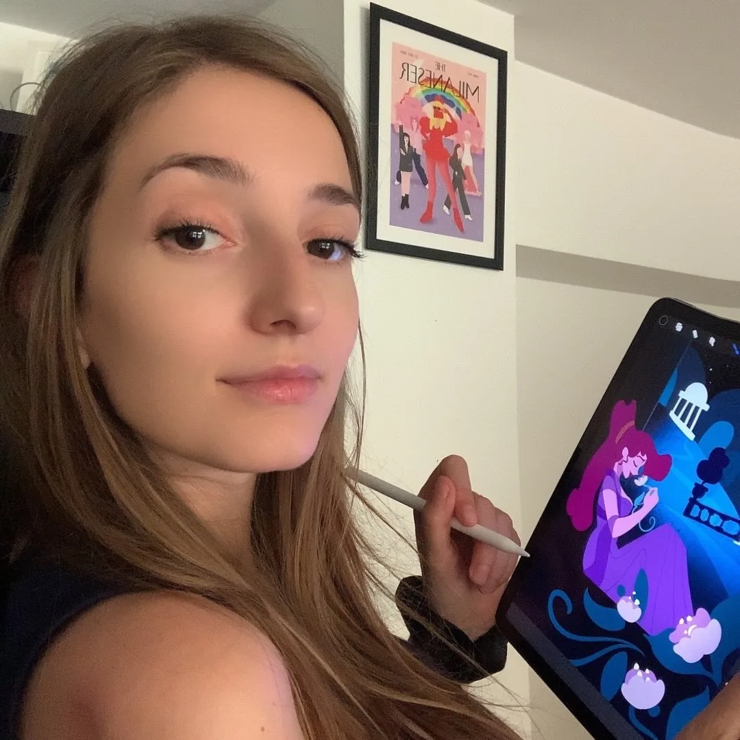
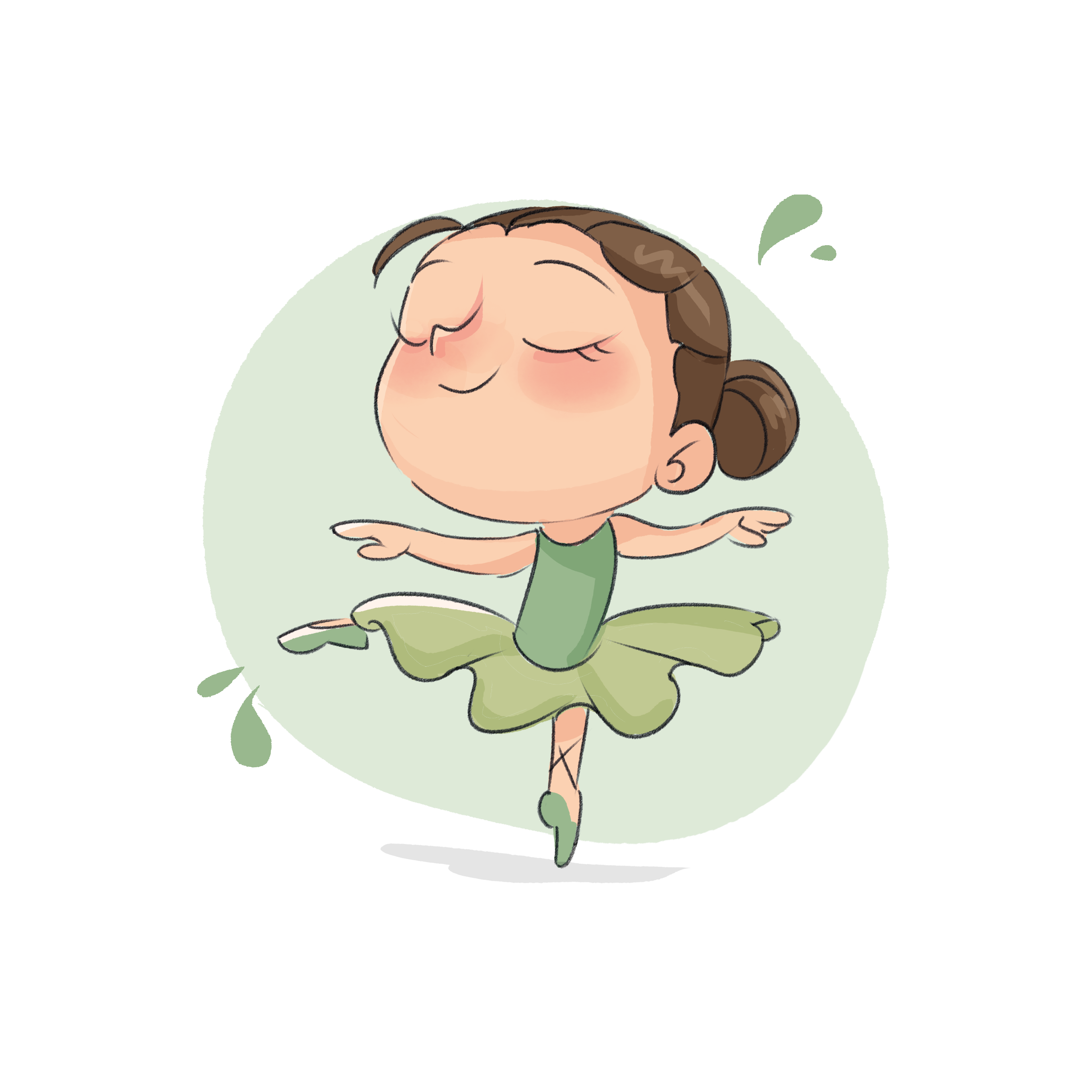
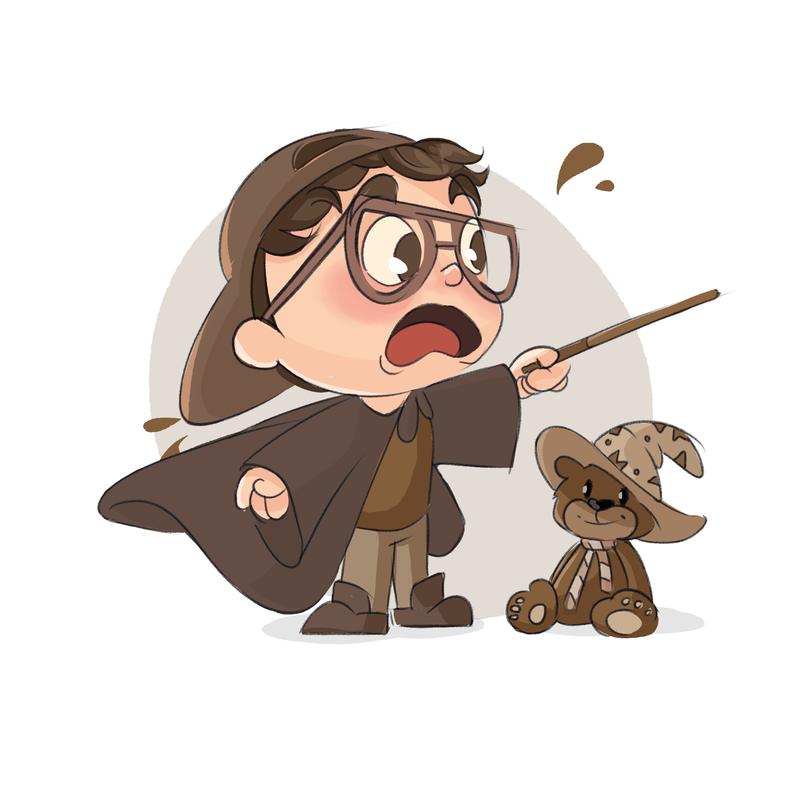
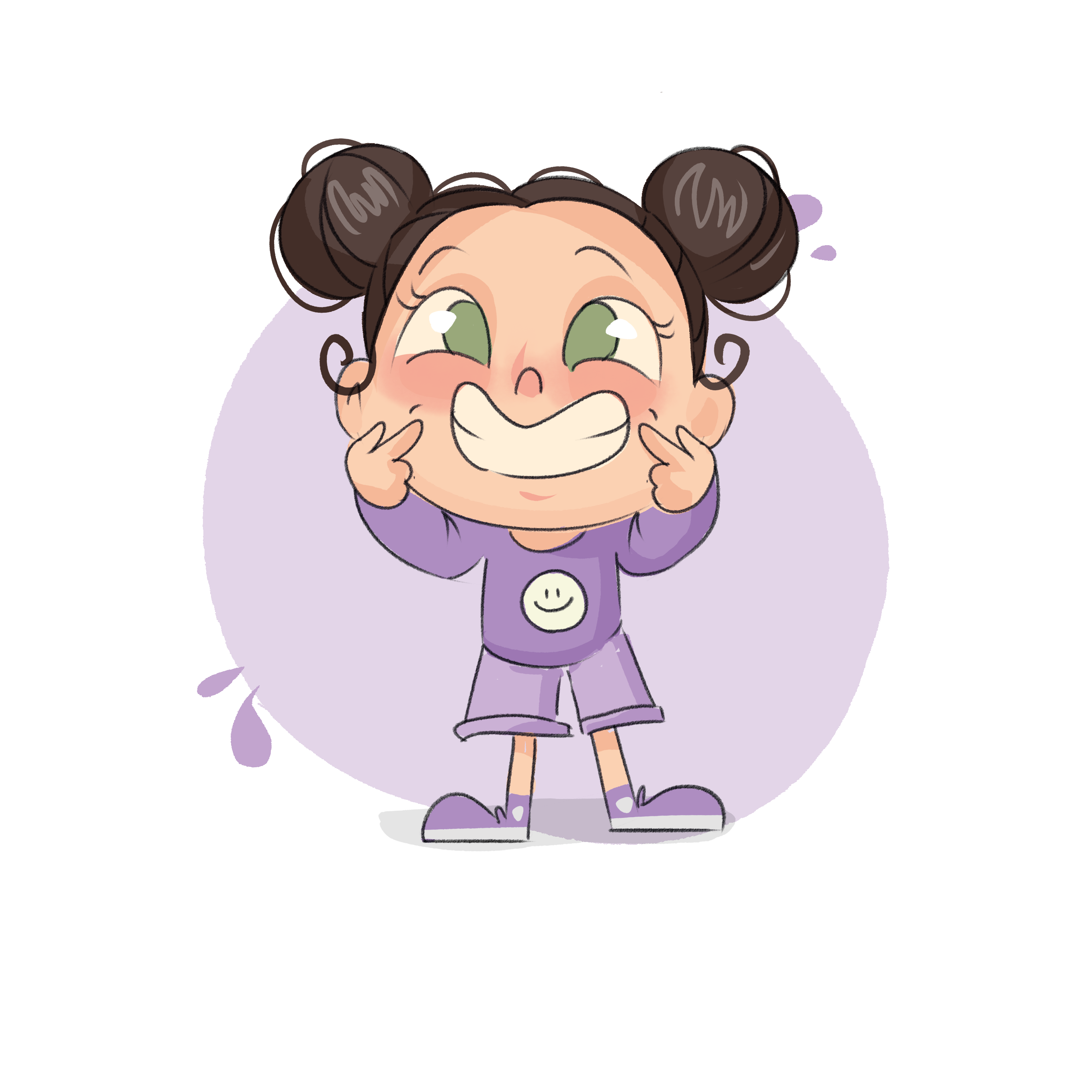
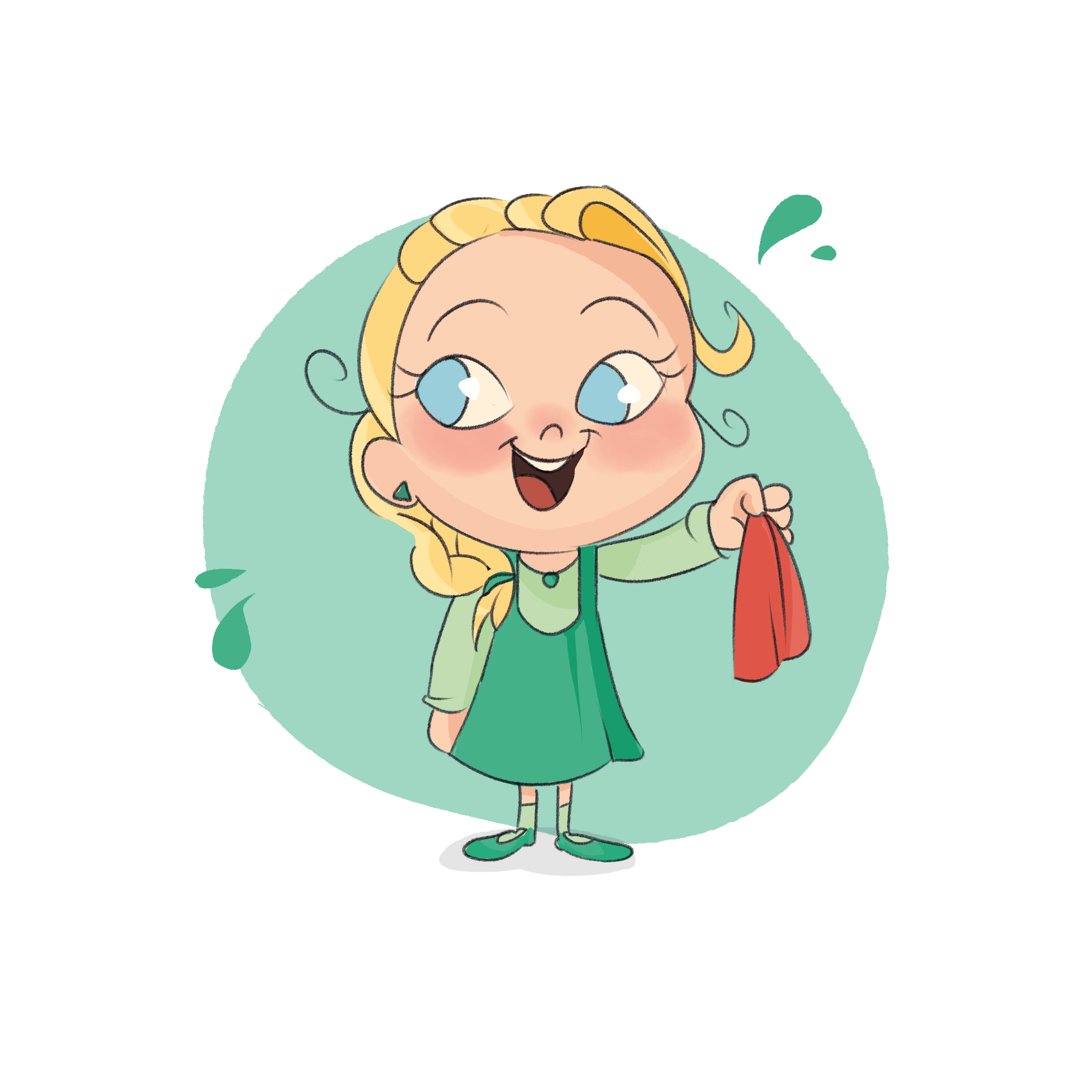
My creative path started with a passion for illustration nurtured since adolescence, and blossomed at Politecnico di Milano where I discovered animation and information design.
With over 6 years of experience, I specialise in character design, storytelling and art direction. I collaborate with The Visual Agency on animated series and data storytelling for clients including Intesa Sanpaolo, UNICEF, Campari. In parallel, I write and illustrate children's books. I'm also a guest lecturer at Politecnico di Milano.
see my work →get in touch
experience
2021 – now
Motion Designer & Illustrator
The Visual Agency, Milan
Animated series, character design, art direction
2022 – now
Guest Lecturer
Politecnico di Milano
Strumenti e Tecniche per l'animazione
2021
Motion Graphic Designer
WeSchool
Jan 2020
Information Designer
University of Amsterdam
2019 – 2020
Motion Graphic Designer Intern
The Visual Agency, Milan
Oct 2019
Information Designer
University of Bologna
2018 – now
Freelance Illustrator
Children's editorial & illustrated books
education
2019 – 2021
MSc Communication Design
Politecnico di Milano
2016 – 2019
BSc Communication Design
Politecnico di Milano
awards
2026
✦ Indigo Award Silver
Echoes of Tomorrow — The Visual Agency · BIP
tools
After EffectsIllustratorPhotoshopProcreateRiveFigma
skills
Character design
Art direction
Illustration
Motion graphics
Data storytelling
Interaction design
Want to work together on something beautiful?
get in touch ↗
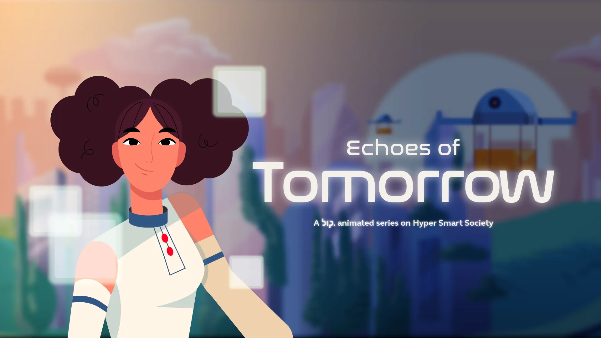
Echoes of Tomorrow
The Visual Agency · BIP · 2025 · ✦ Indigo Award Silver
Character design · Art directionAnimation · Storyboard
A 7-episode animated series communicating the pillars of BIP's Society 5.0. I designed Alice, a girl living in a hyper-connected future, and built the entire visual world around her.
Client
BIP — The Visual Agency
Year
2025
Award
Indigo Award Silver 2026
"I stopped asking 'how do we explain this?' and started asking 'how does it feel to live it?' Alice makes the future feel normal."
Character design — Alice
Not a futuristic symbol: a real person navigating an extraordinary world. Warm, curious, confident. The character went through multiple iterations, studying expression ranges, proportions and cultural references, before landing on a design that could carry the emotional weight of 7 different episodes.
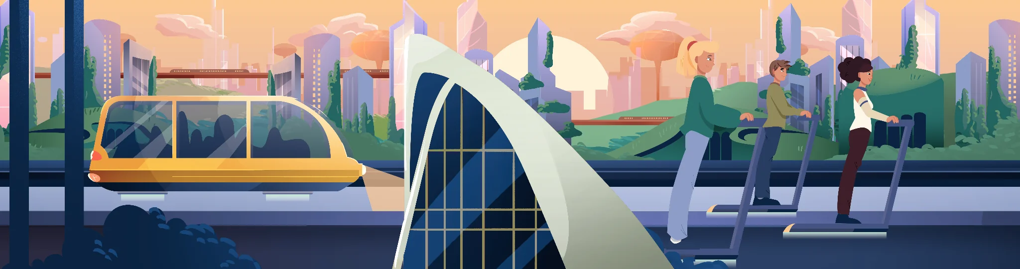
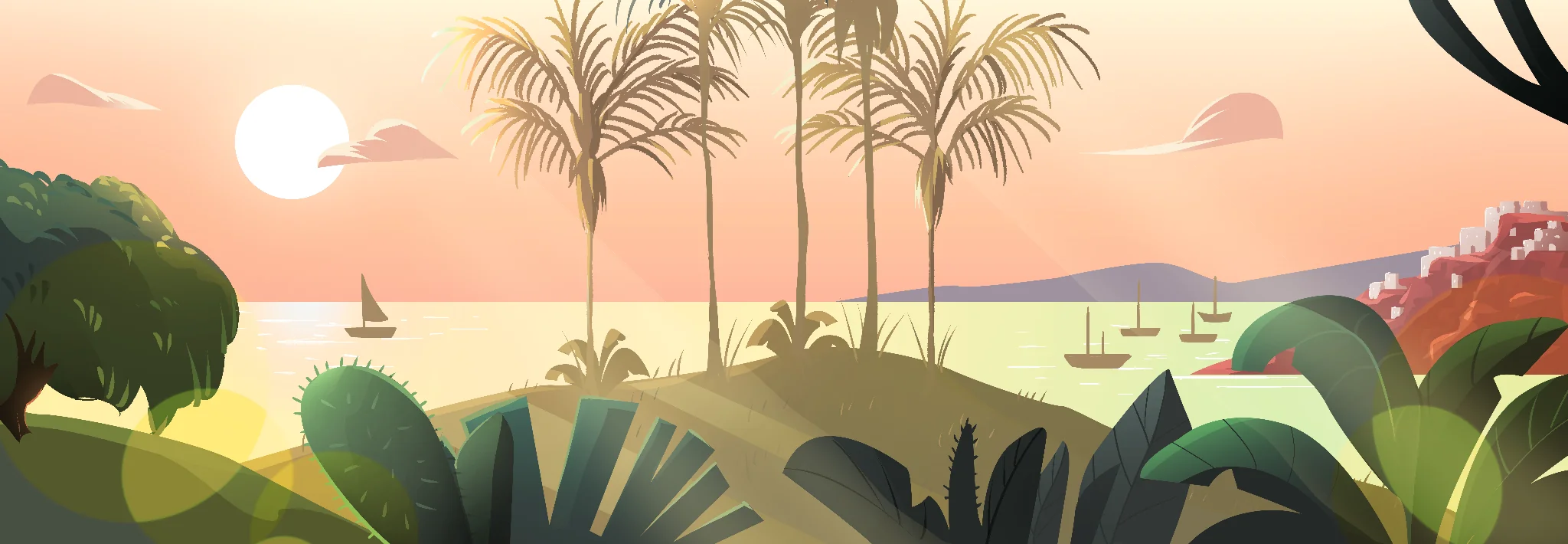
Environments
Each episode needed a distinct visual world, from smart cities to regenerated natural environments, always futuristic and human at the same time.
Selected episodes
Three pillars of Society 5.0, each a different world seen through Alice's eyes.
Smart Economy
In a Society 5.0 economy, decisions aren't made alone. Agentive AI reads context, anticipates needs, and acts: turning a simple purchase into a personalised financial conversation in real time.
Smart Living
Smart Living means technology that disappears into everyday life. A gesture, a scan, a thought: the home responds.
Space Economy
The next frontier isn't just above us; it's working for us. Space technologies monitor, predict and protect life on Earth, while new economies emerge beyond the atmosphere.
The supporting cast
Alice's parents appear throughout the series. They were directly inspired by my own. A personal touch hidden in plain sight.
Full project at TVA →
My role
Character designArt directionStoryboardAnimationBackgrounds
← Previous
OTZI
Next →
Story of a Tomato
Story of a Tomato
Tecnoalimenti / UNI · 2024
Character design · IllustrationAnimation · Storyboard
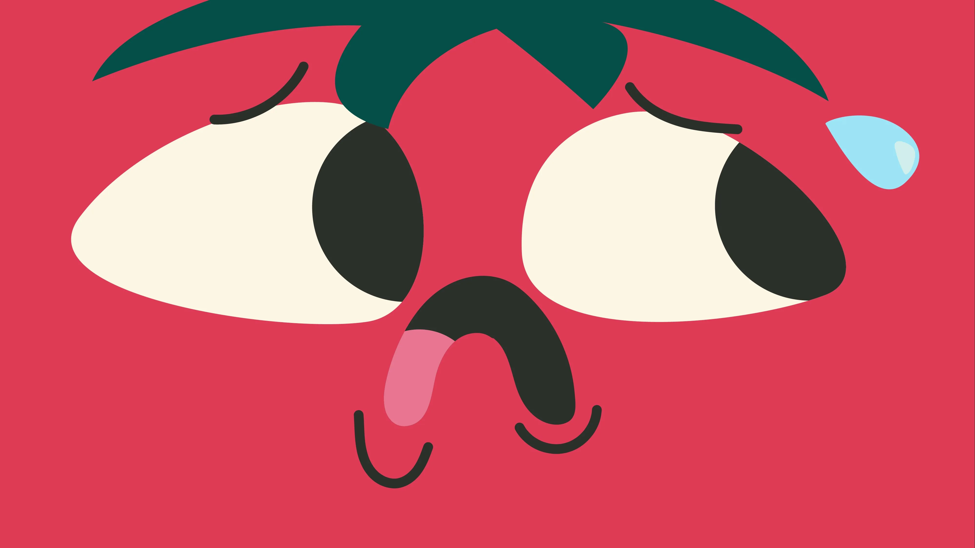
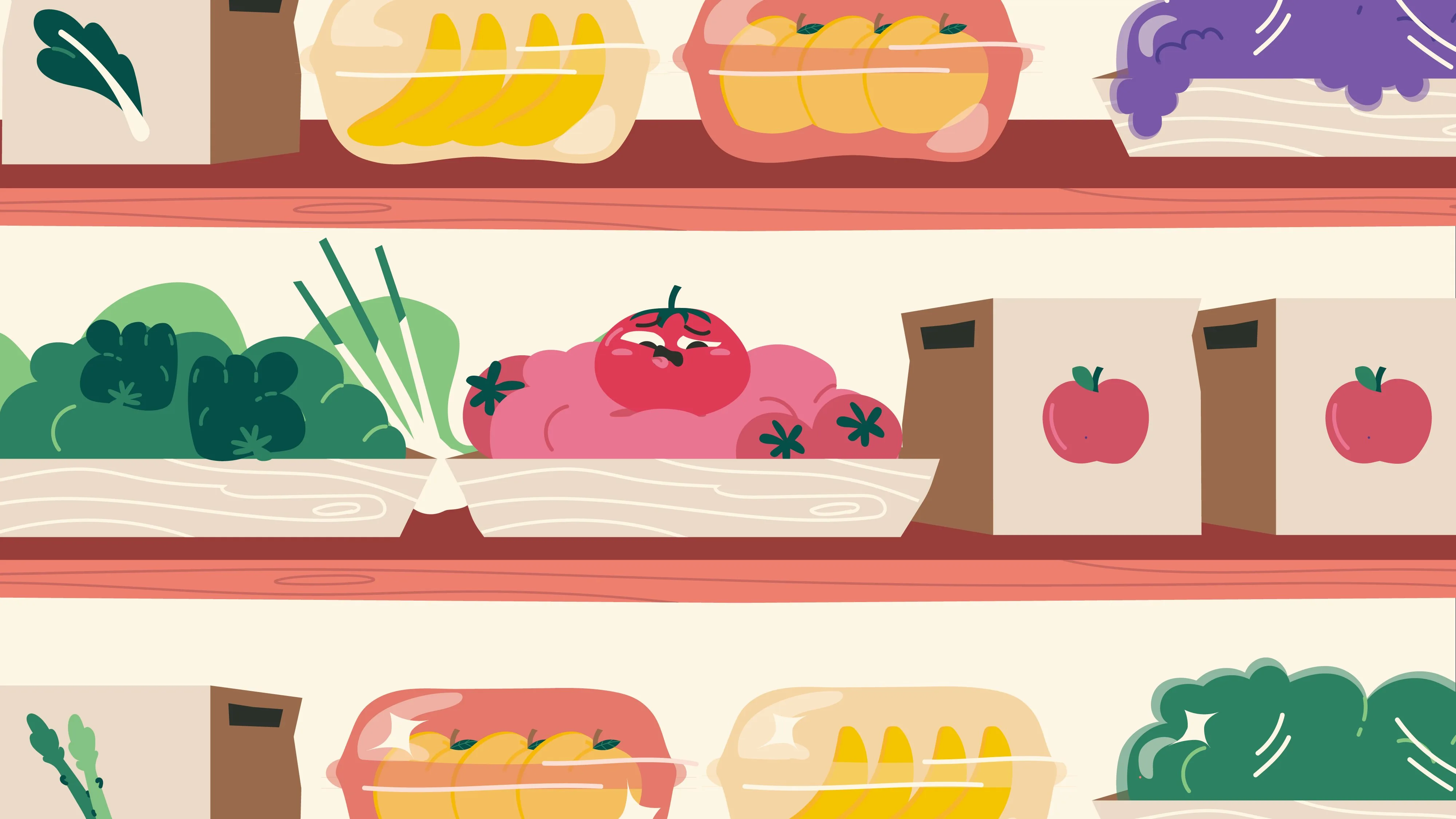
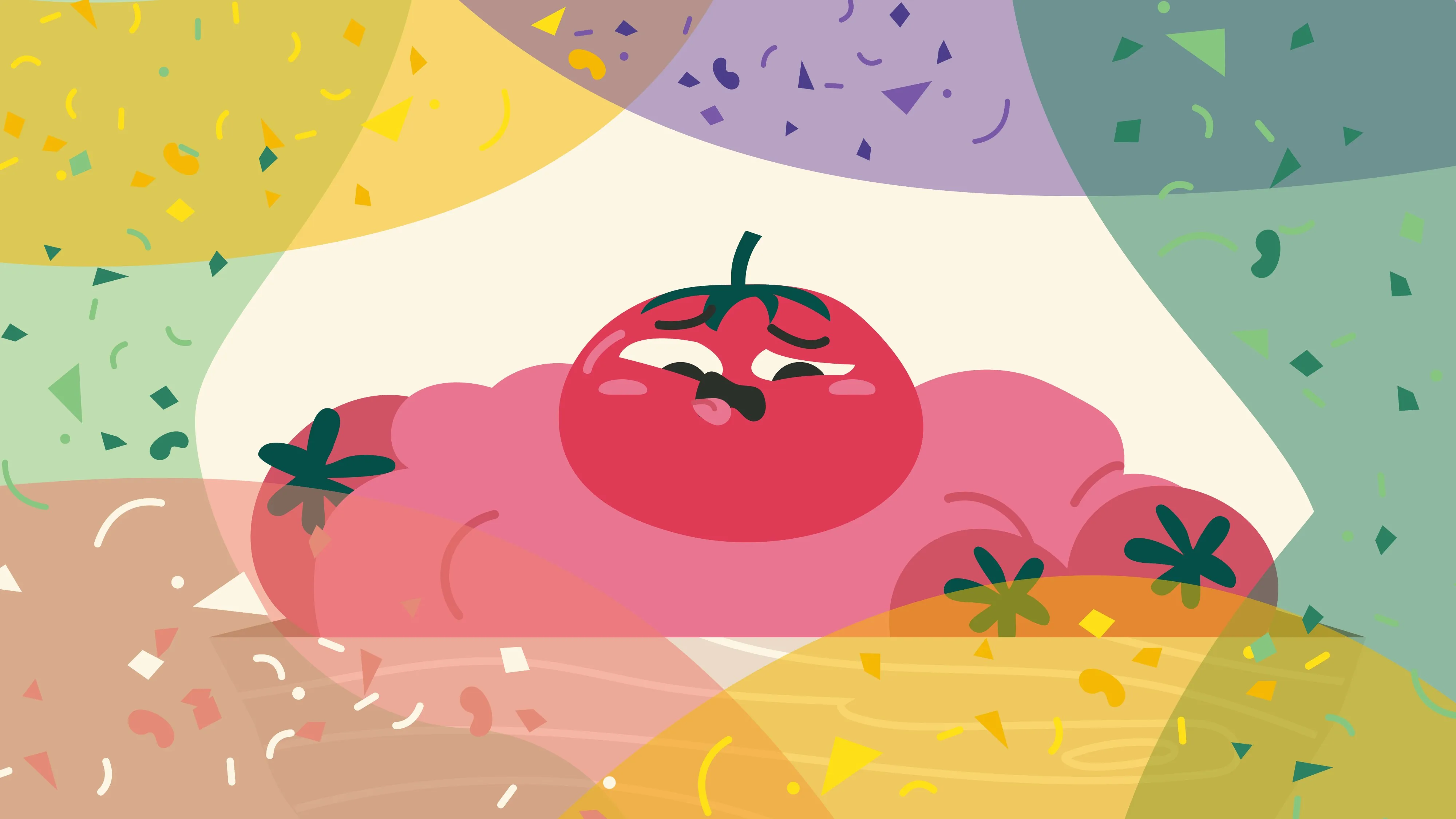
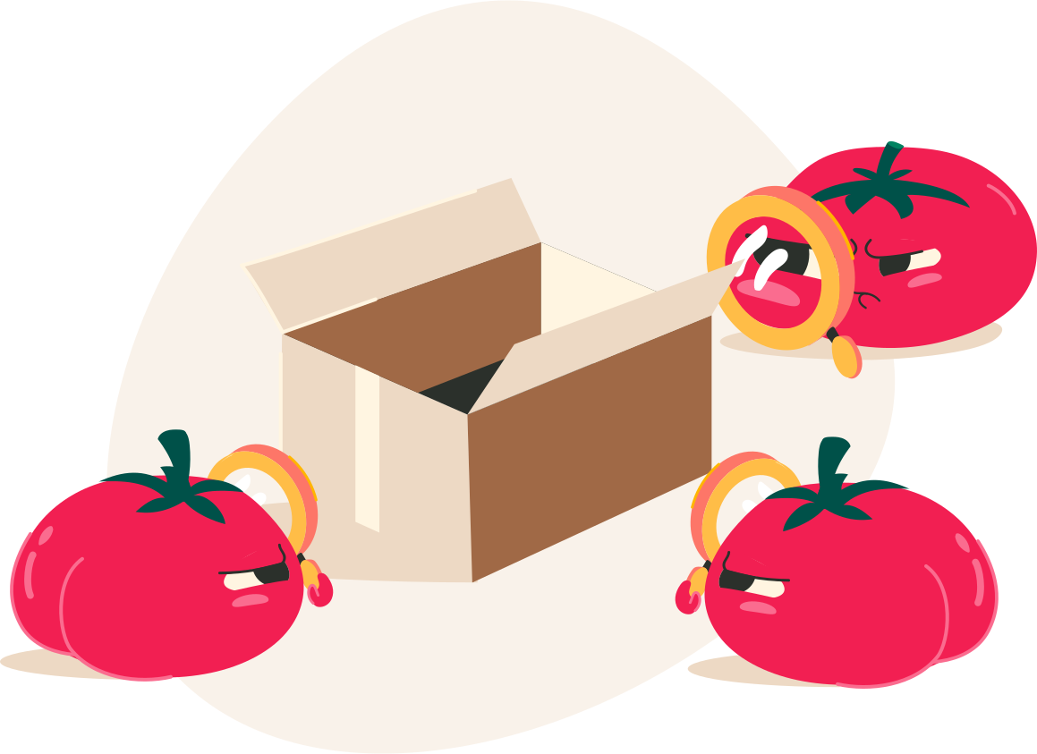
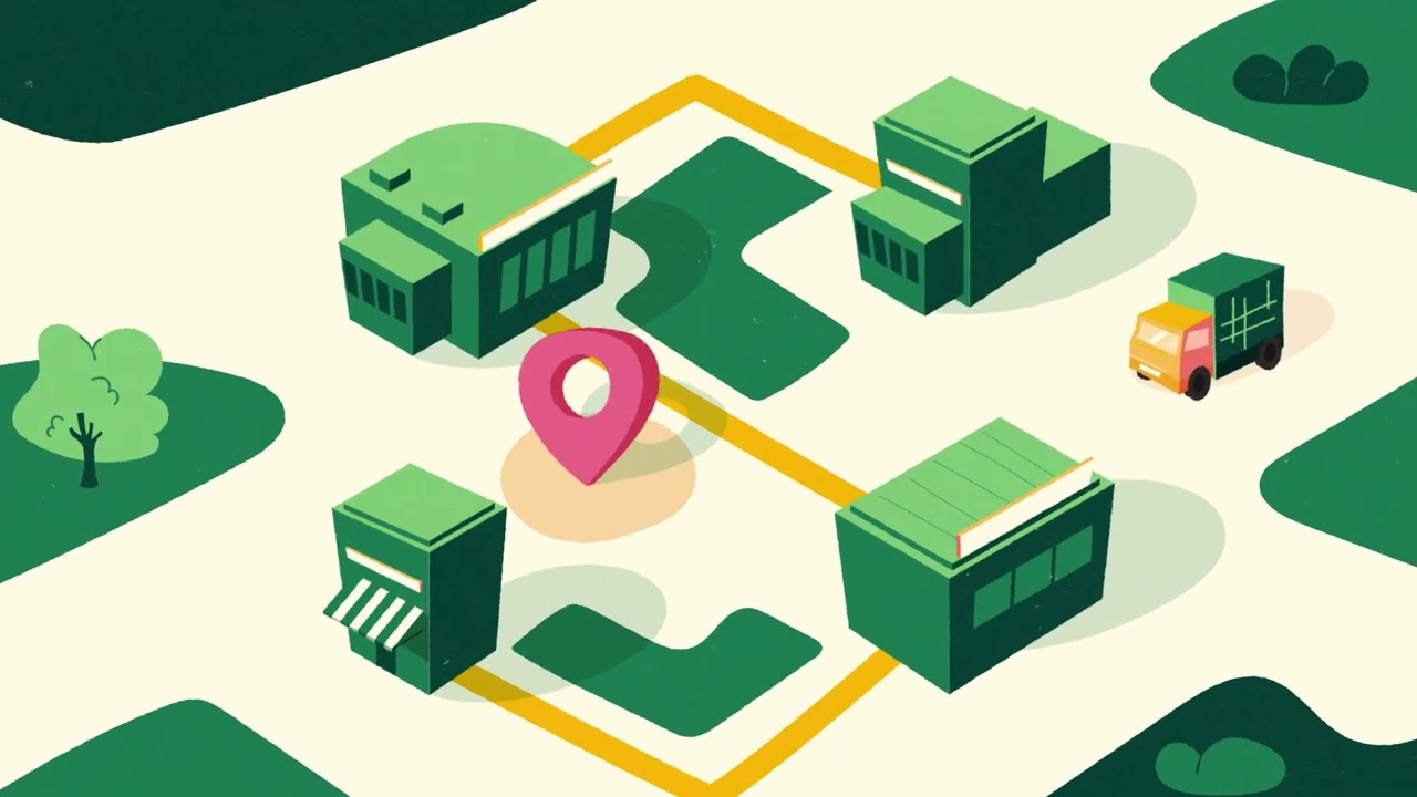
An explainer video communicating the Reference Practice for reducing microplastic emissions in the food supply chain, narrated entirely from the perspective of a tomato with sunglasses.
Client
Tecnoalimenti / UNI
Year
2024
Production
The Visual Agency
The concept
Instead of a dry, didactic explanation of microplastics, the video adopts an unexpected point of view: the tomato itself, a character who lives the problem firsthand. Simple, colourful style, organic shapes, complete focus on expressiveness. Scientific communication that people actually want to watch.
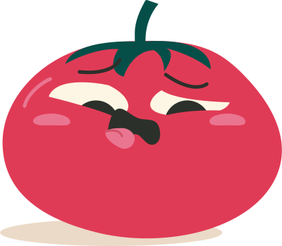
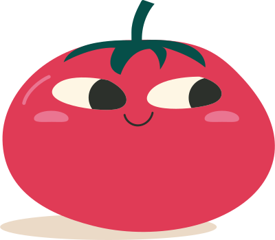
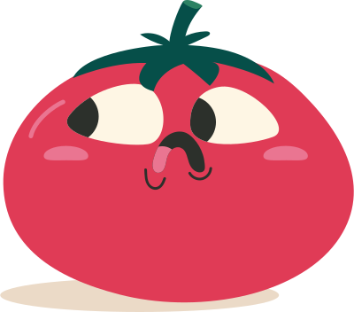
Character design
The tomato went through multiple expression studies to find the right balance between comedy and sincerity.
My role
Character designIllustrationStoryboardAnimation
← Previous
Echoes of Tomorrow
Next →
Nimbo
Nimbo — Air quality
The Visual Agency · KIUU · 2024
Character design · World designIllustration · Animation
The Visual Agency · KIUU · 2024
Nimbo is a living, breathing data creature whose appearance and mood shift in real time with the air quality index. I designed the character from scratch: anatomy, expression range, colour states, and all animation assets for the automated daily video pipeline.
ClientThe Visual Agency / KIUU
Year2024
My focusCharacter design
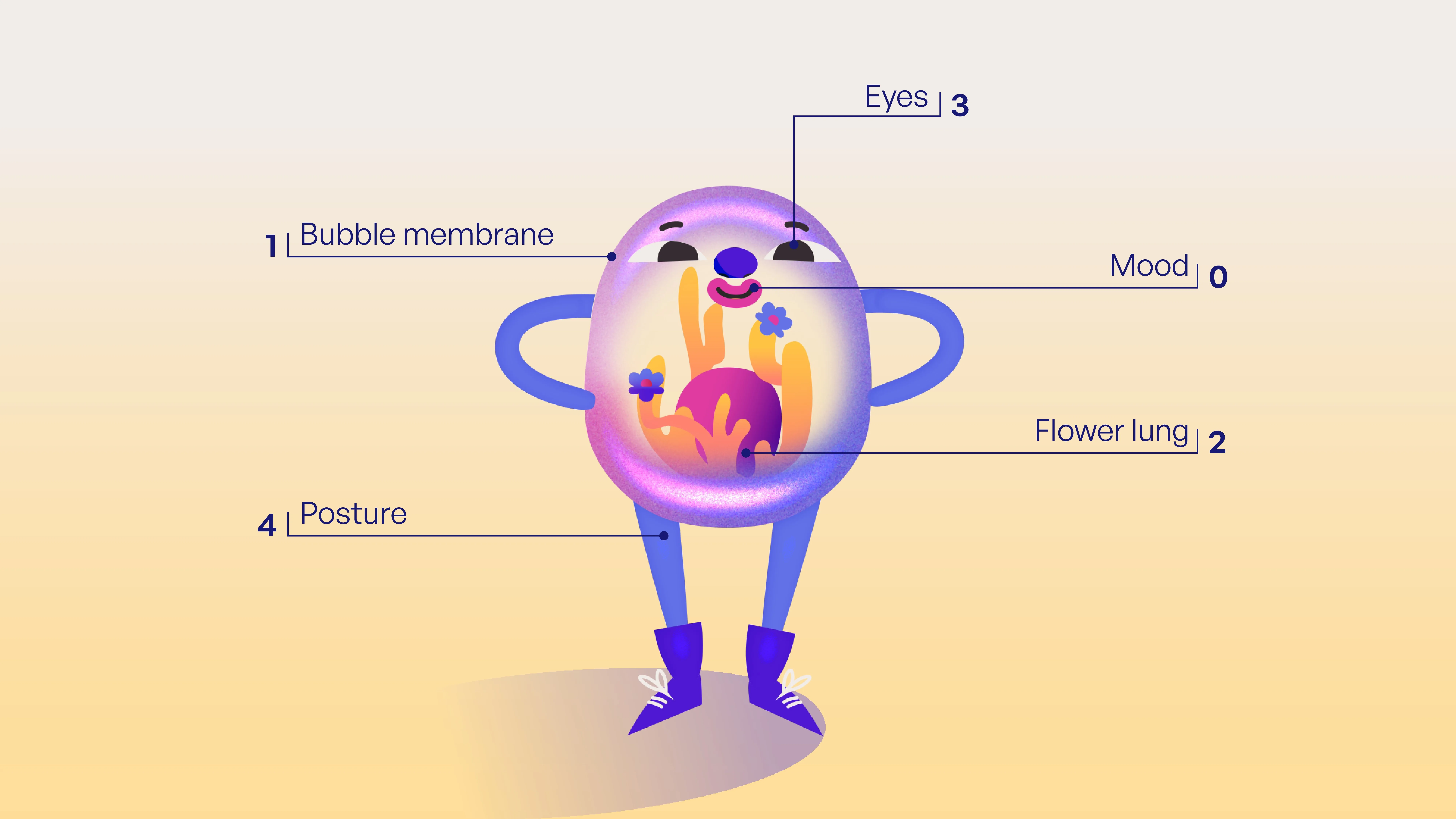
Character anatomy
Inspired by Chernoff faces, each physical element maps to a specific air quality indicator. The bubble membrane changes opacity and colour, the flower lung blooms or wilts, posture shifts with pollution levels.
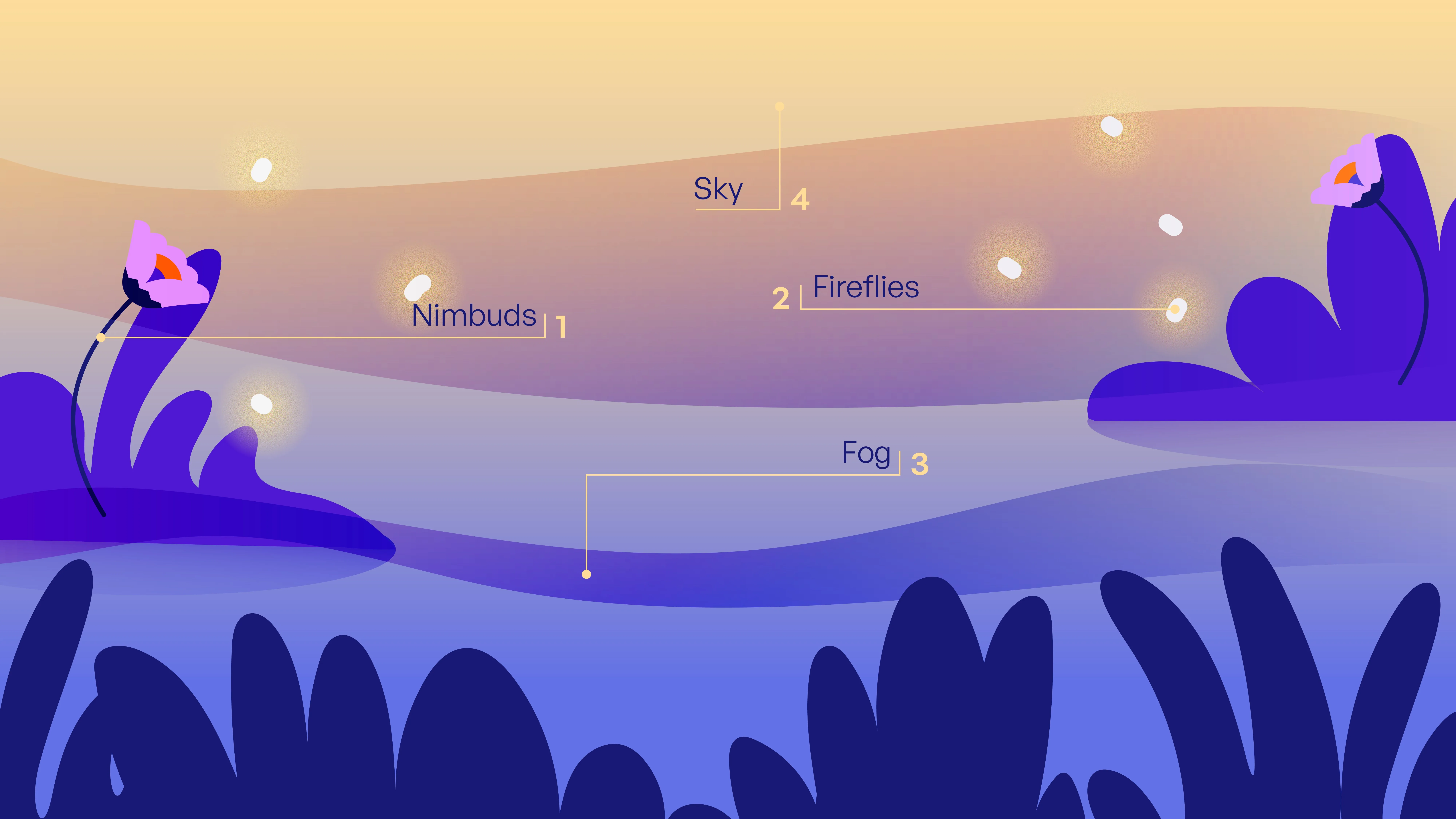
State change
Each day Nimbo transforms automatically based on the real AQI reading, shifting across the full spectrum from healthy to polluted, animated and generated without human intervention.
The full Nimbo system (automated pipeline, dashboard, daily outputs) lives at The Visual Agency.
Character designWorld designIllustrationAnimationArt direction
← Previous
Story of a Tomato
Next →
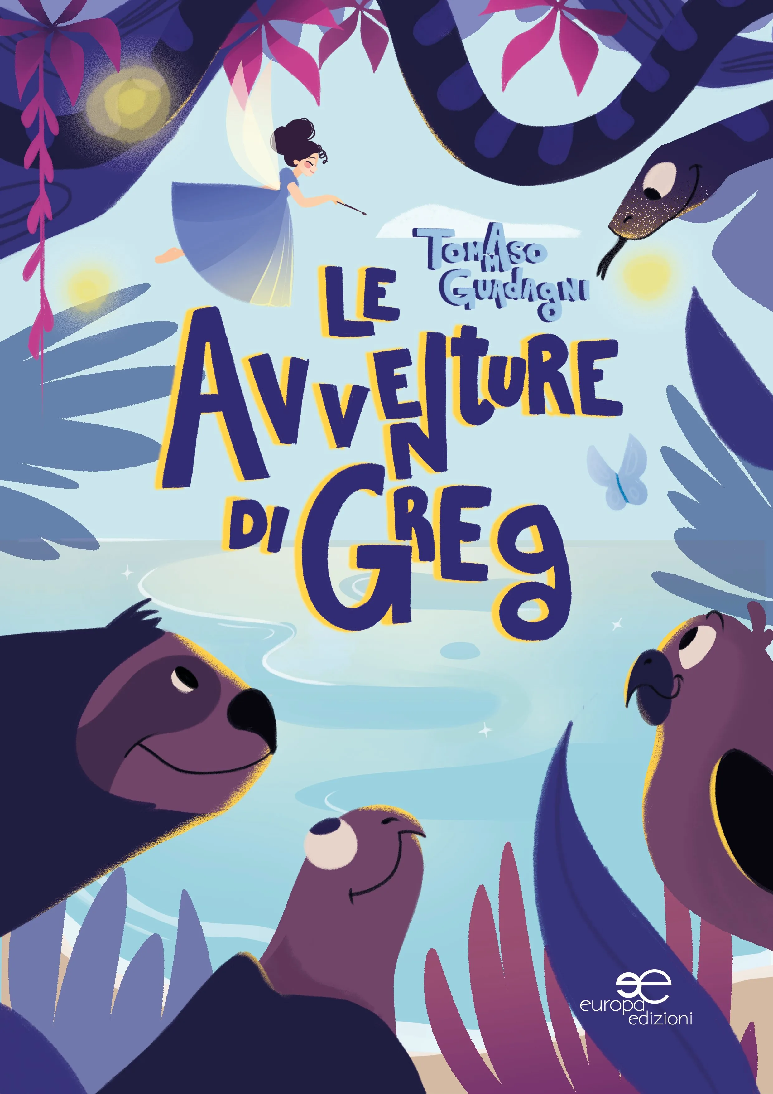
Le Avventure di Greg
Le Avventure di Greg
Europa Edizioni · 2024
Cover illustrationCharacter design · Art direction
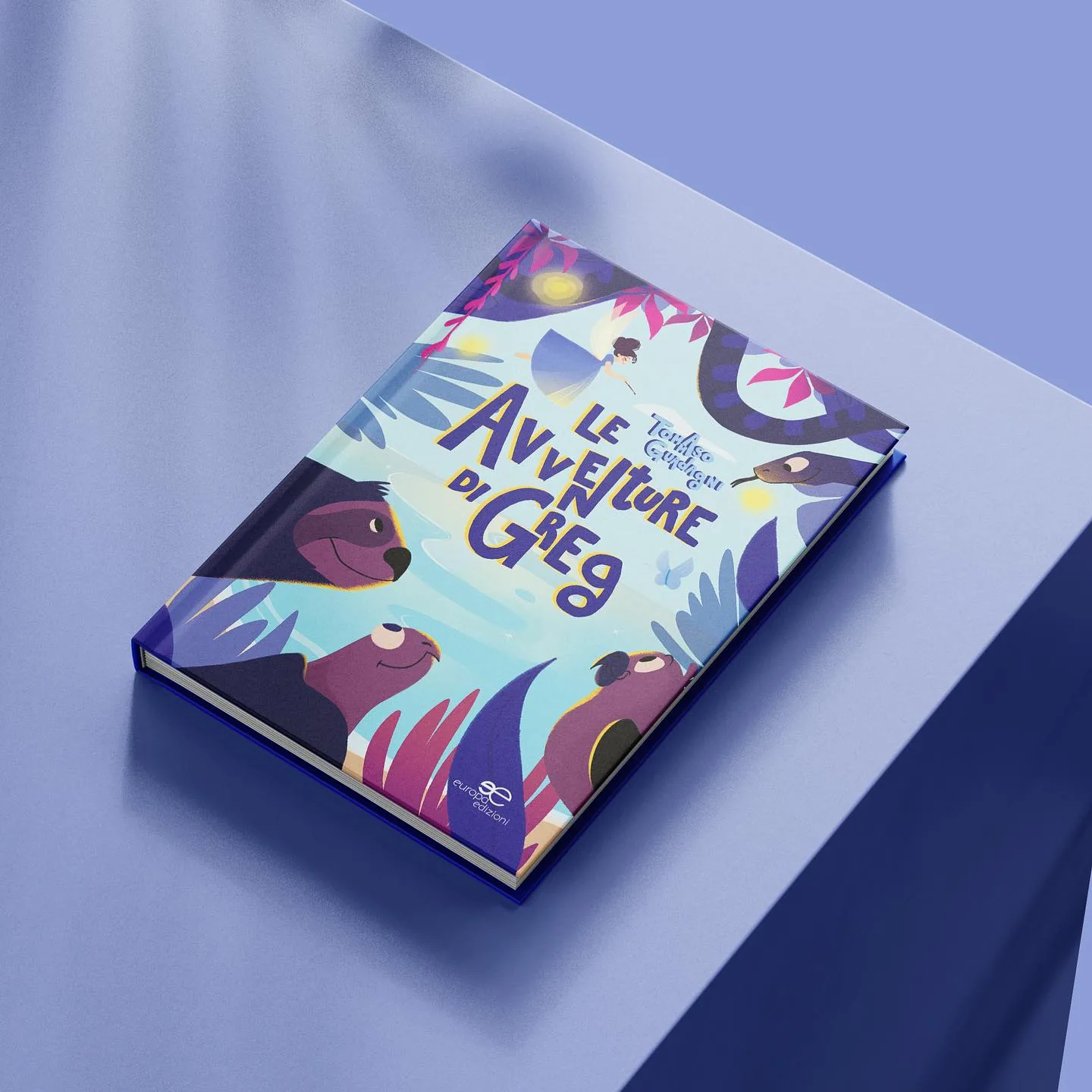
Cover and illustrations for Tommaso Guadagni's children's novel. The book collects the stories of different characters, all named Greg, who carry feelings and courage to save the world, moving between real and imaginary places.
Publisher
Europa Edizioni
Year
2024
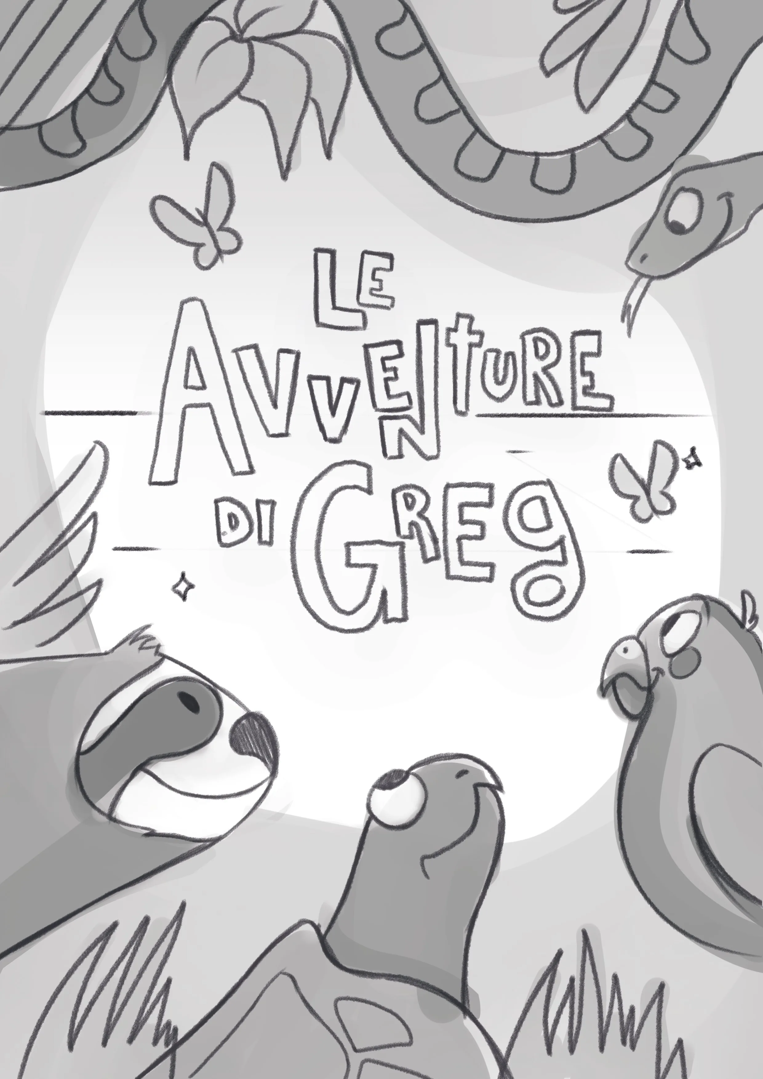
From sketch to final
The composition went through several rounds of revision to balance text placement with character positions: the title typography needed to feel part of the illustration, not imposed on top of it.
My role
Cover illustrationCharacter designArt direction
← Previous
Nimbo
Next →
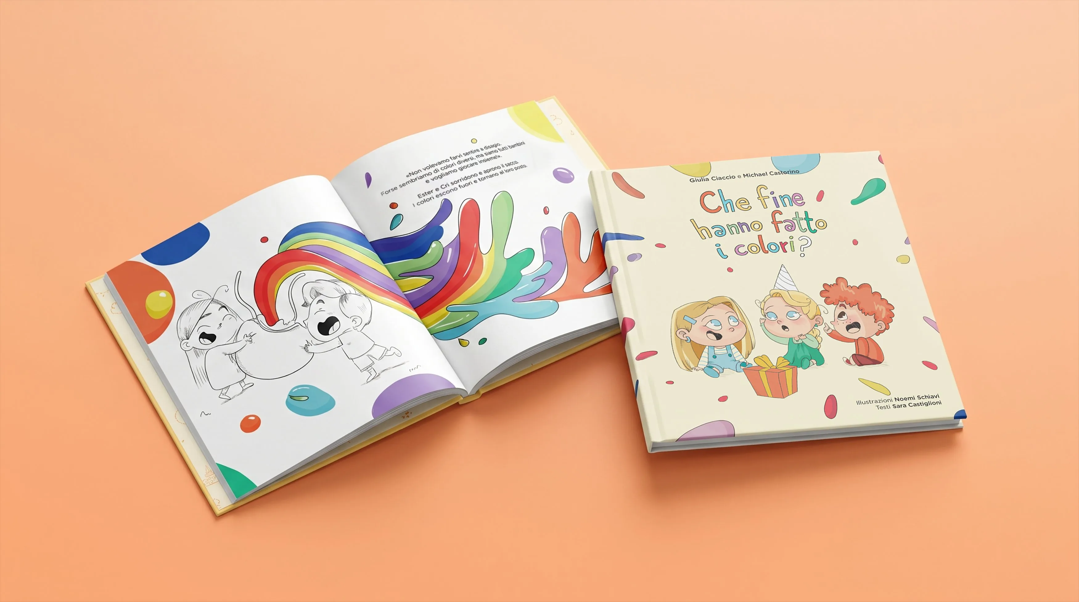
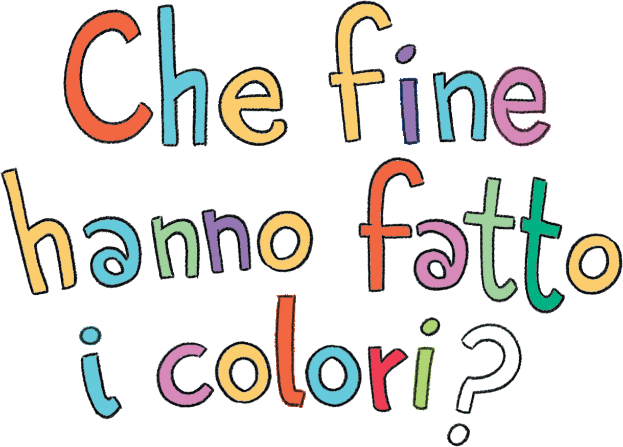
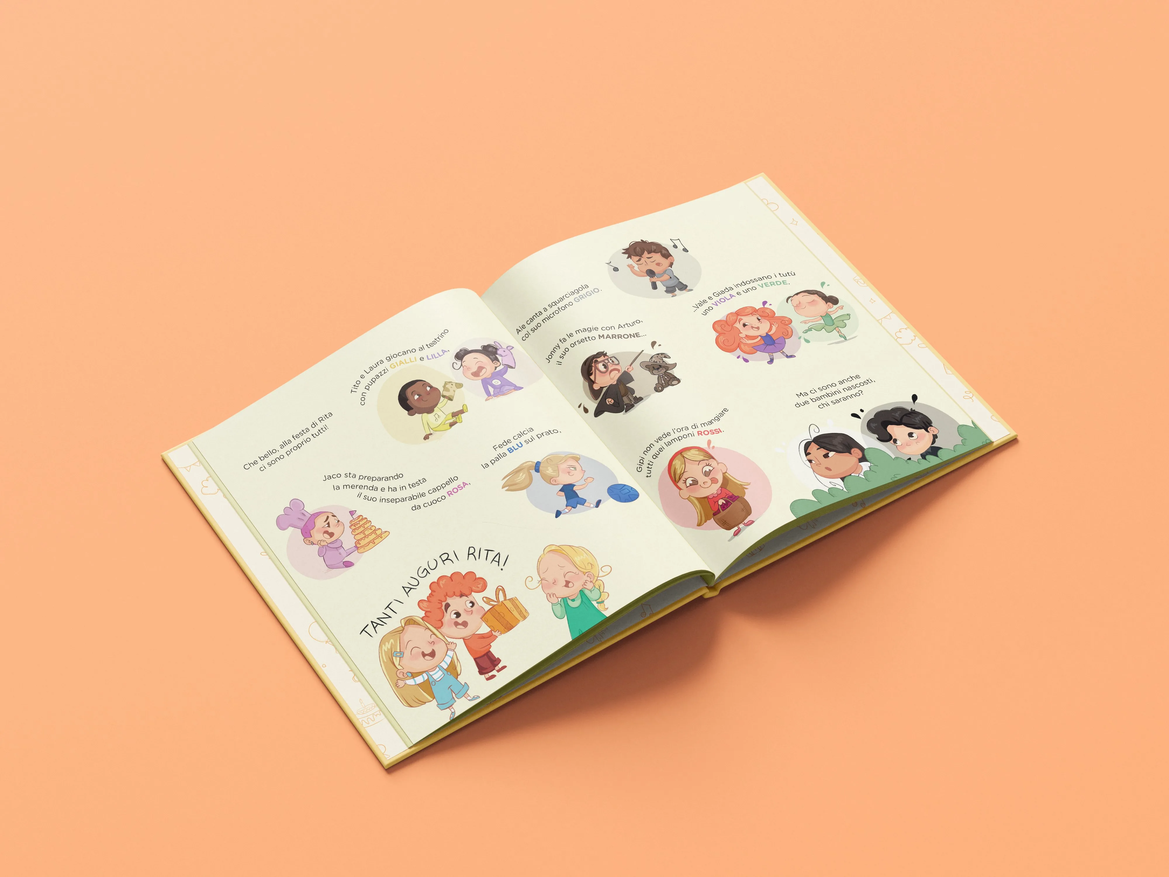
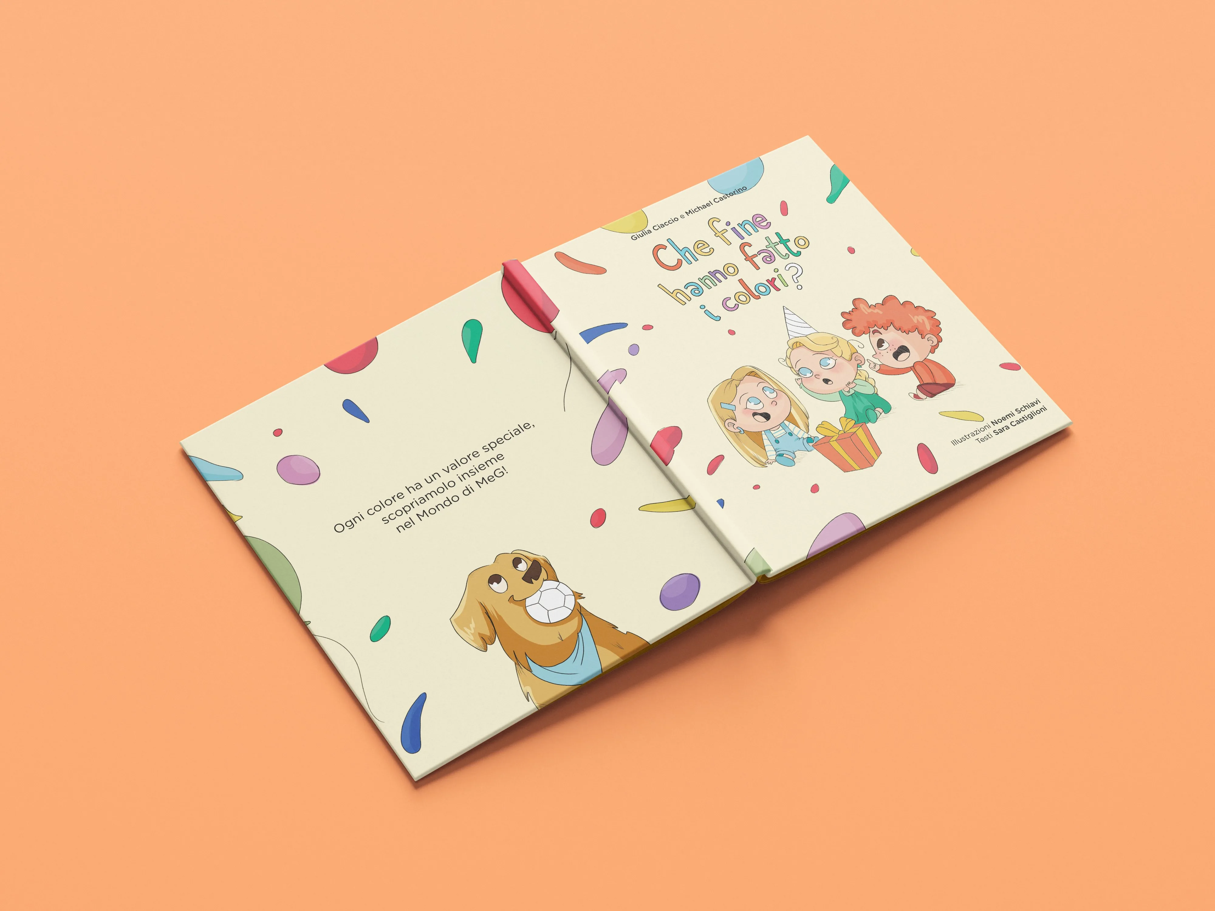
Che fine hanno fatto i colori?
Che fine hanno fatto i colori?
Il Mondo di MeG · 2025
Illustration · Character designVisual development
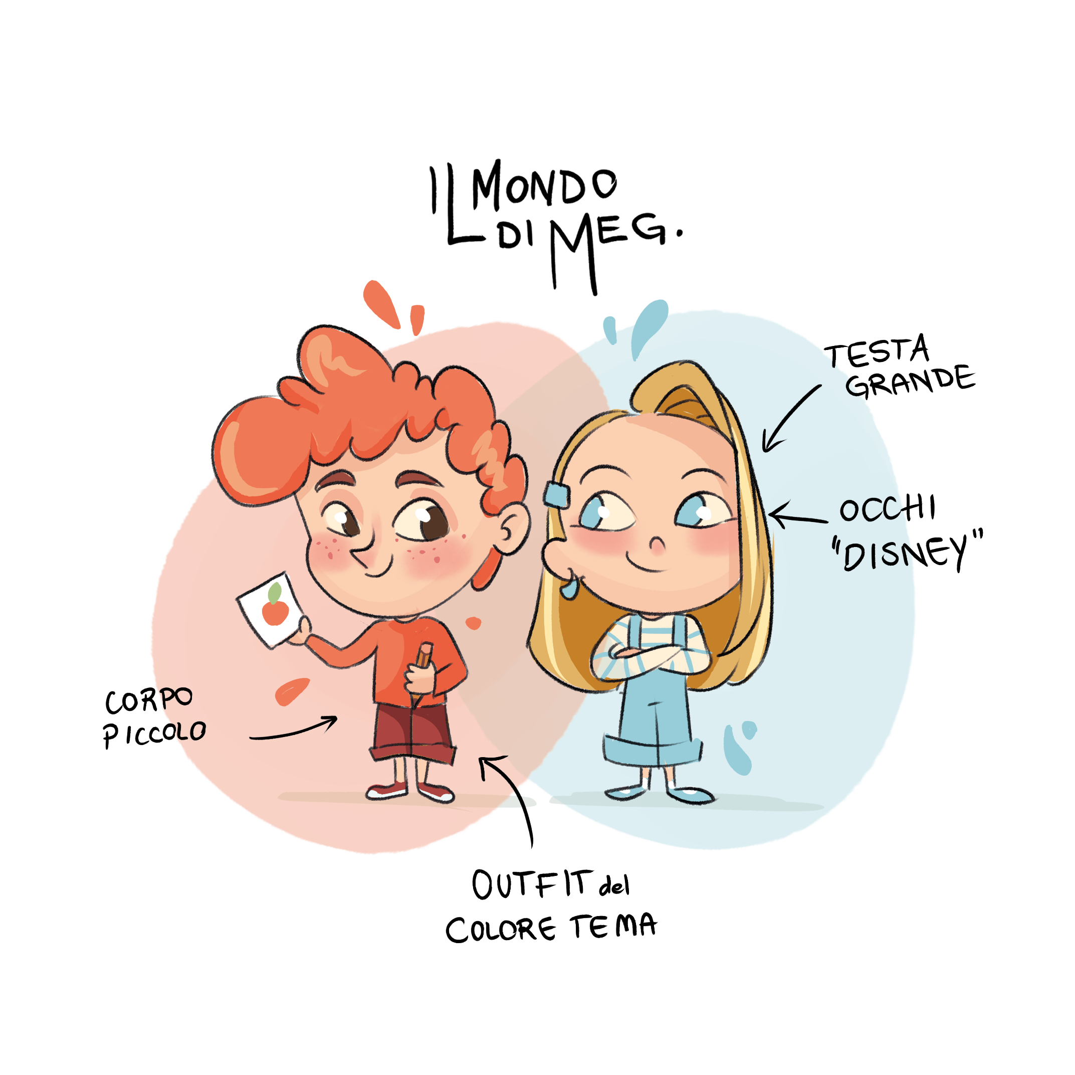
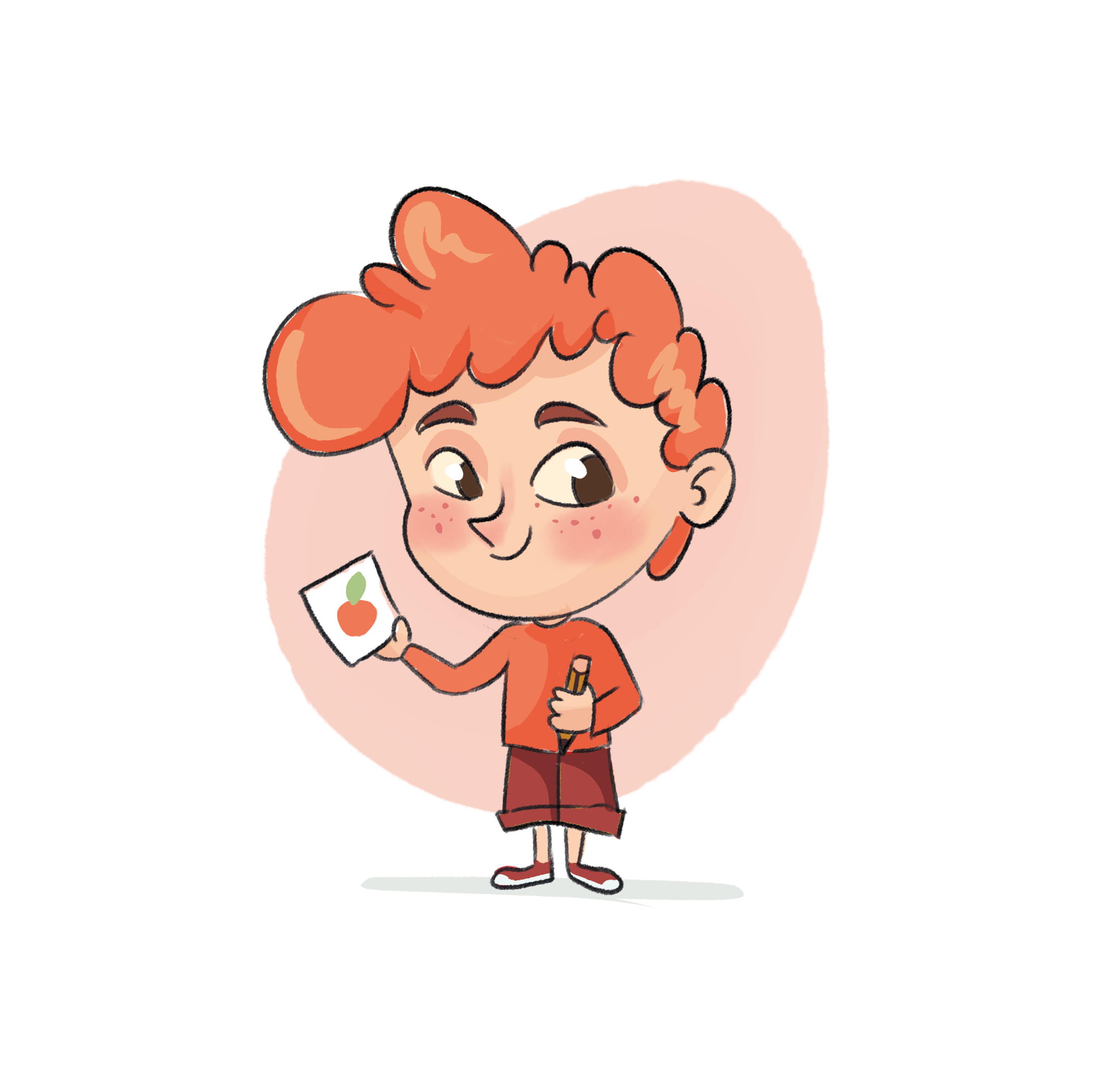
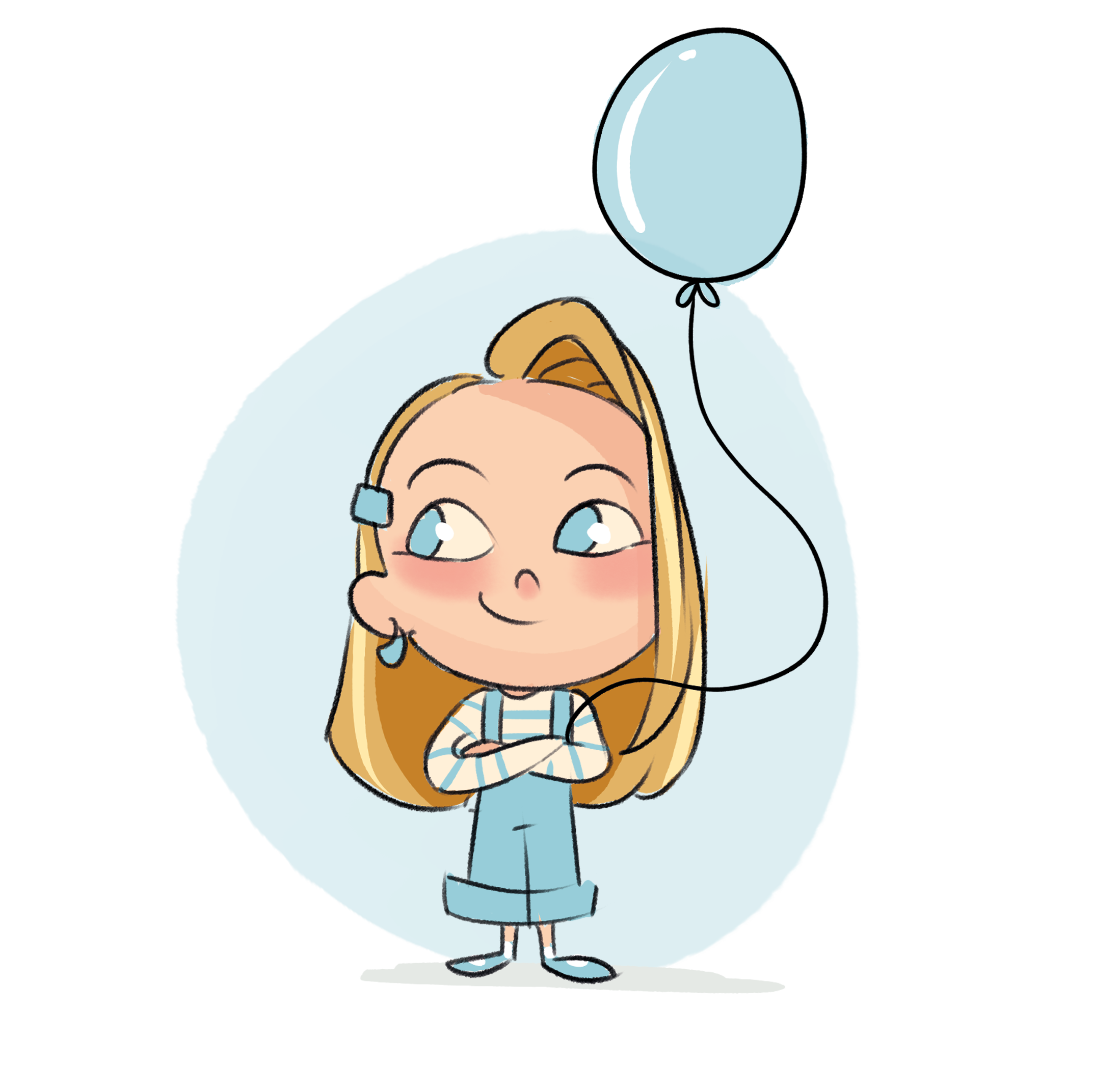
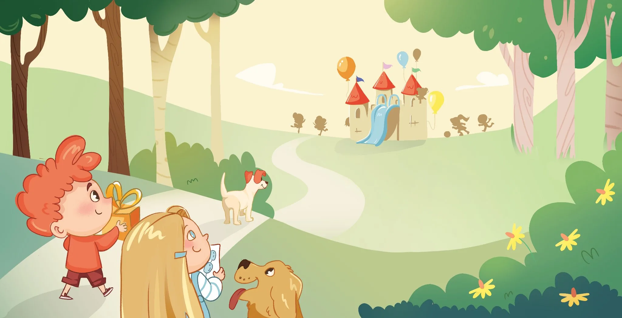
An illustrated book about diversity and inclusion. When colours disappear from MeG's world, two children discover that only by playing together, embracing each other's differences, the colours can return.
Year
2025
Theme
Diversity · Inclusion
Storyboard
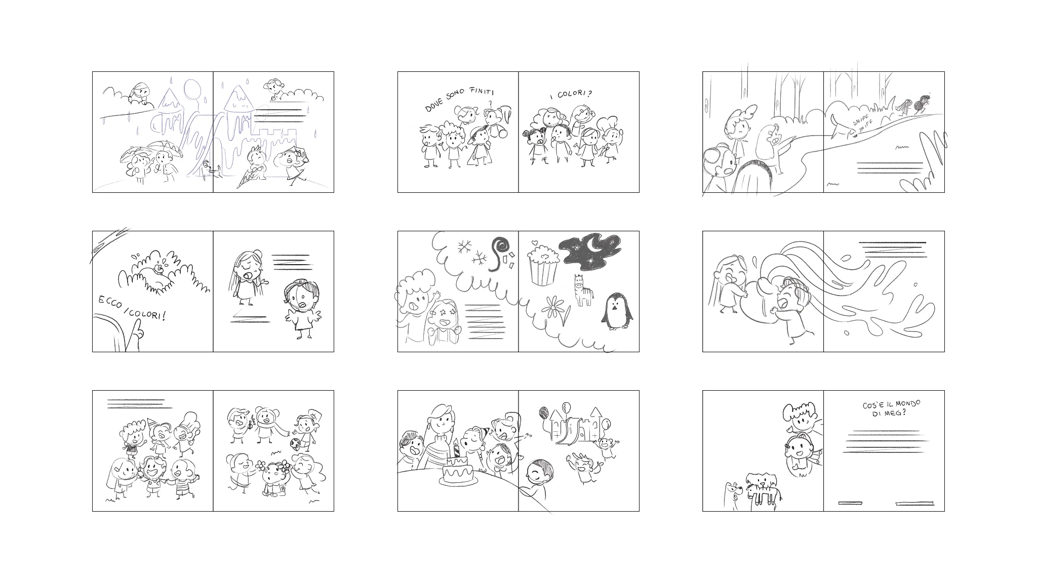
The narrative arc was mapped frame by frame before any final illustration. Each spread had to carry both the emotional beat and the visual rhythm of the story.
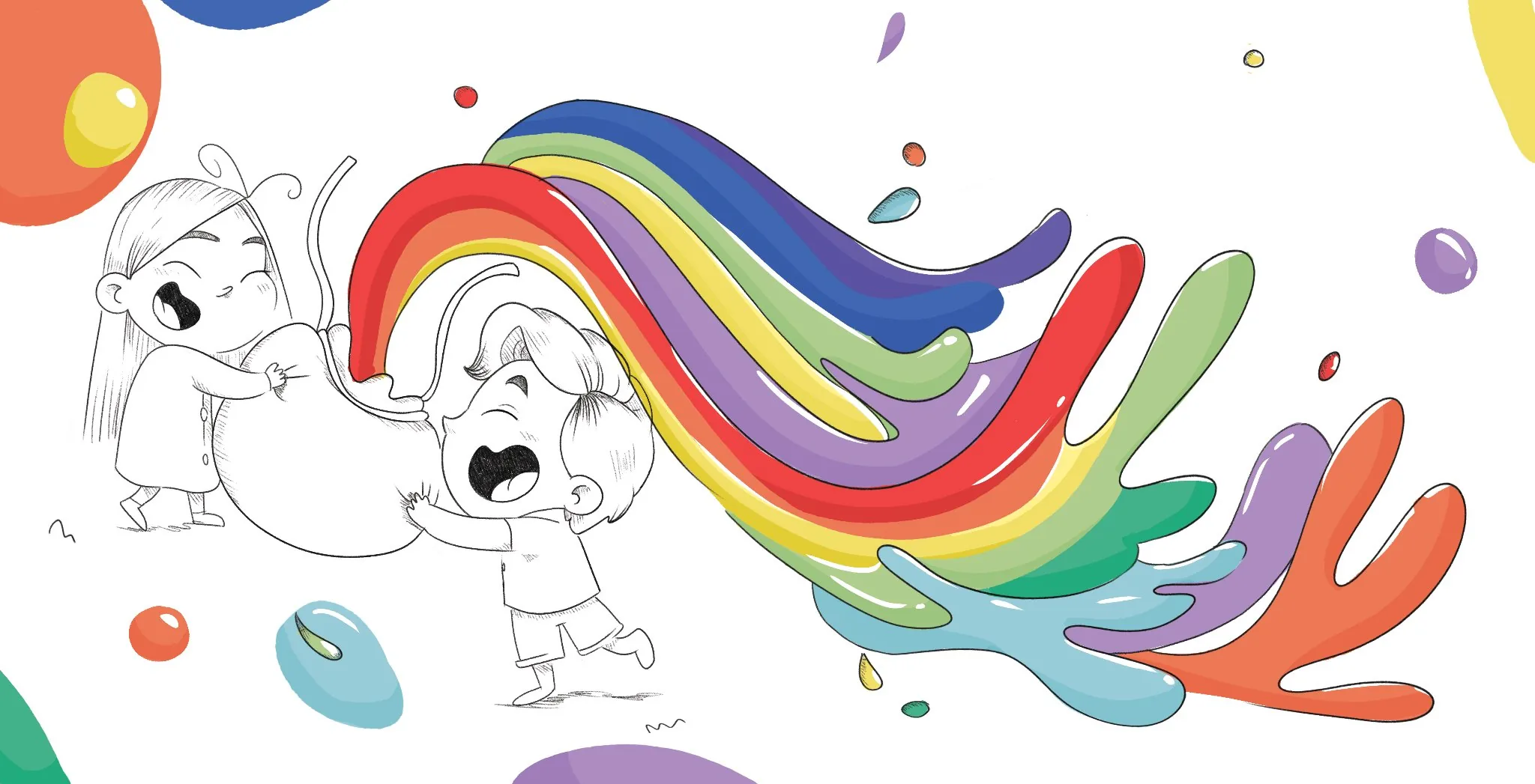
The moment the colours return
The climactic spread: colours bursting back into the world. The contrast between the black-and-white sketch and the erupting rainbow was a core concept from the very beginning.
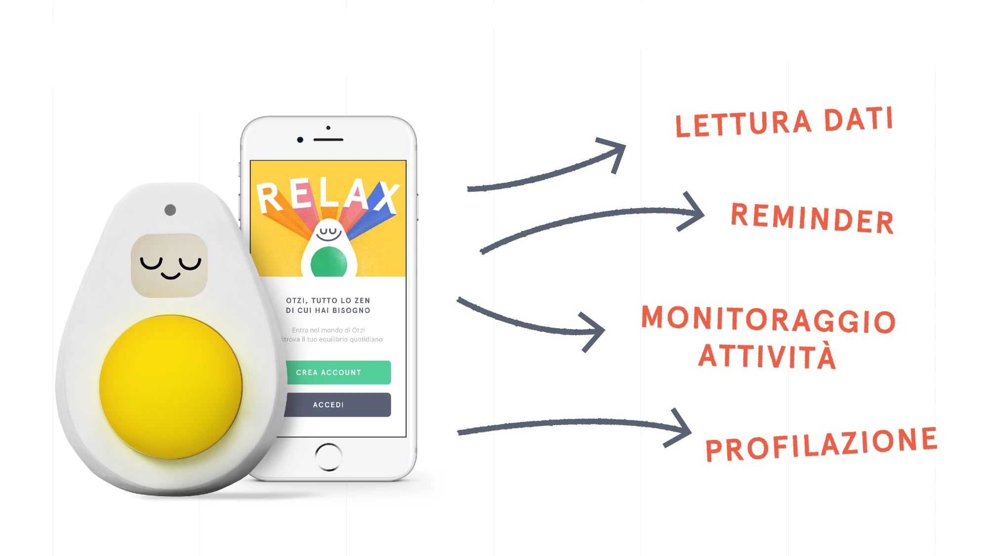
An interactive smart toy for stress management: a glowing avocado with a special seed guiding relax, focus and sleep sessions. Born from months of research and focus groups at Politecnico di Milano.
Context
Politecnico di Milano
Year
2020
Team
with Alice Ziantoni, Giuliano Mozzillo
😌 Relax
Calm music · warm green · guided breathing
🎯 Focus
Pomodoro timer · white noise · blue light
🌙 Sleep
Night melodies · dimming warm light
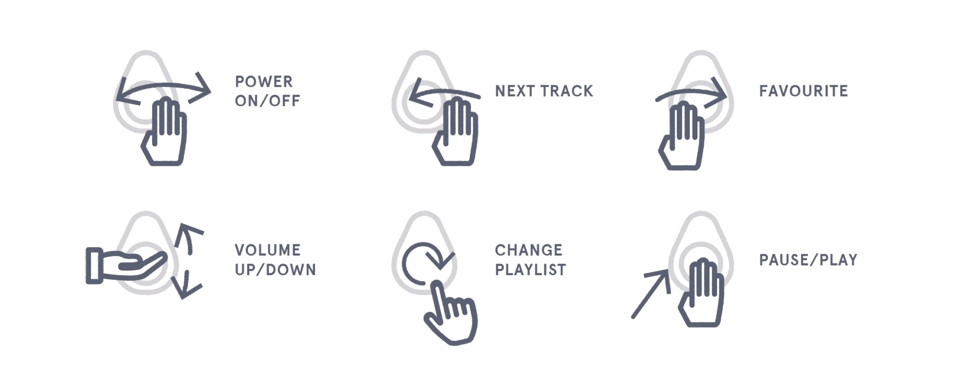
Gesture control
OTZI responds to six distinct hand gestures, each mapped to a specific action like play, pause, skip, or volume. No buttons, no screen: the interaction is entirely physical, keeping the user focused on the experience rather than the interface.